Case : Kuratani
The company, formerly known as Espaço Ki, has been completely reinvented in terms of its visual identity and name.
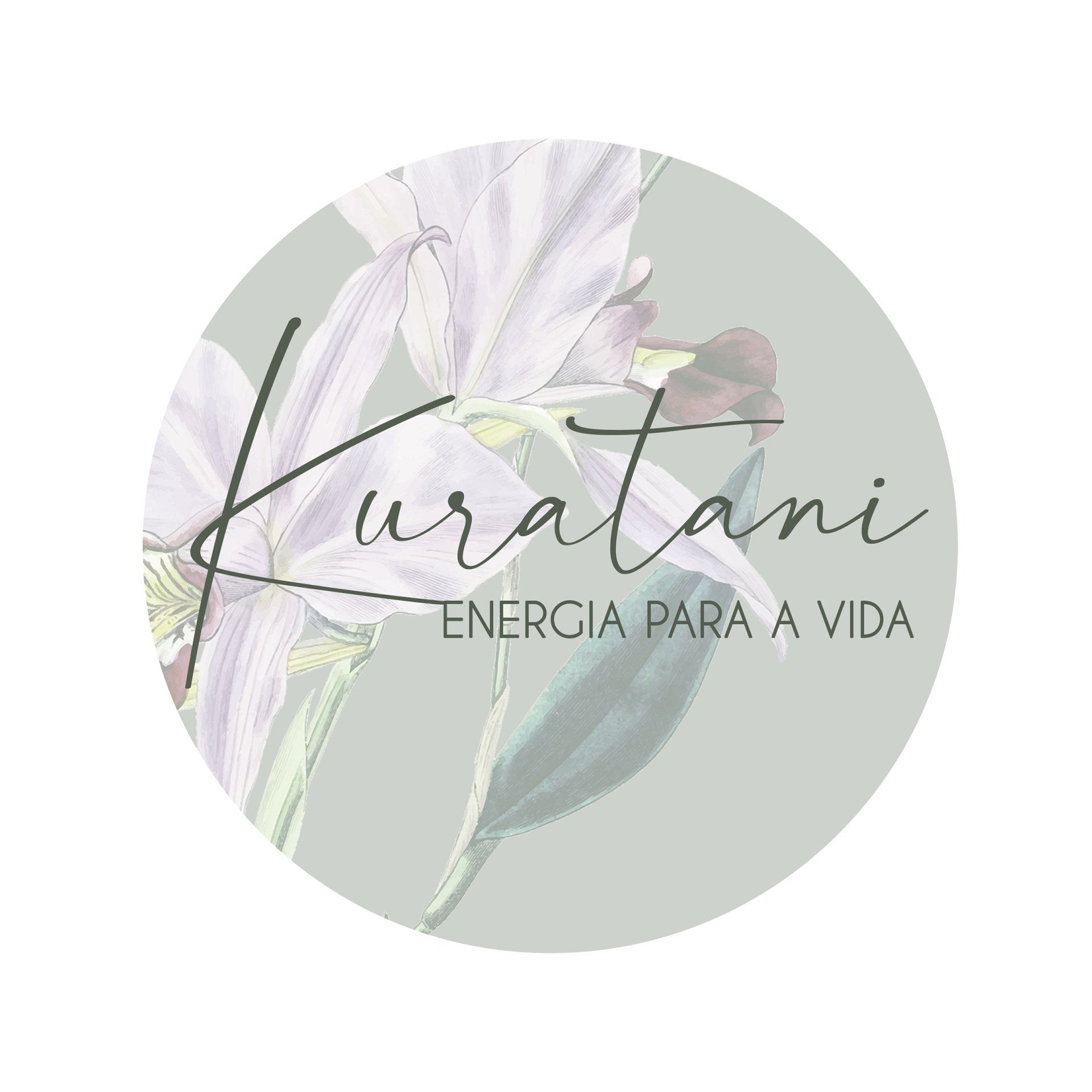
To convey the idea of something light and healing, the owner's surname, which begins with the word KURA, was used, bringing much more meaning to the entire company and brand.
The logo incorporated important and special elements for the brand, with light tones that evoke a sense of peace, lightness, and coziness.
Challenge & Solution
The challenge was to structure the visual identity without losing the way the company already communicated with its customers.
Changing the logo and modifying social media posts is very important when communicating all the changes being made and the reasons behind them to the client.
With the company already established in the market, changing the brand name is extremely important and needs to be done with caution.
With a gradual modification, customers accepted the change and embraced the new Kuratani Space with affection.