

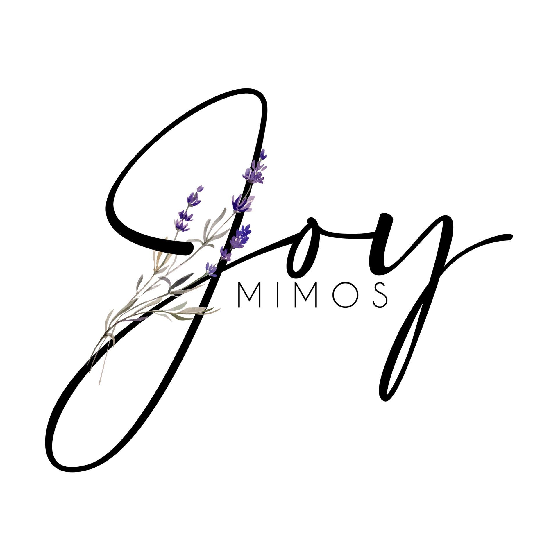
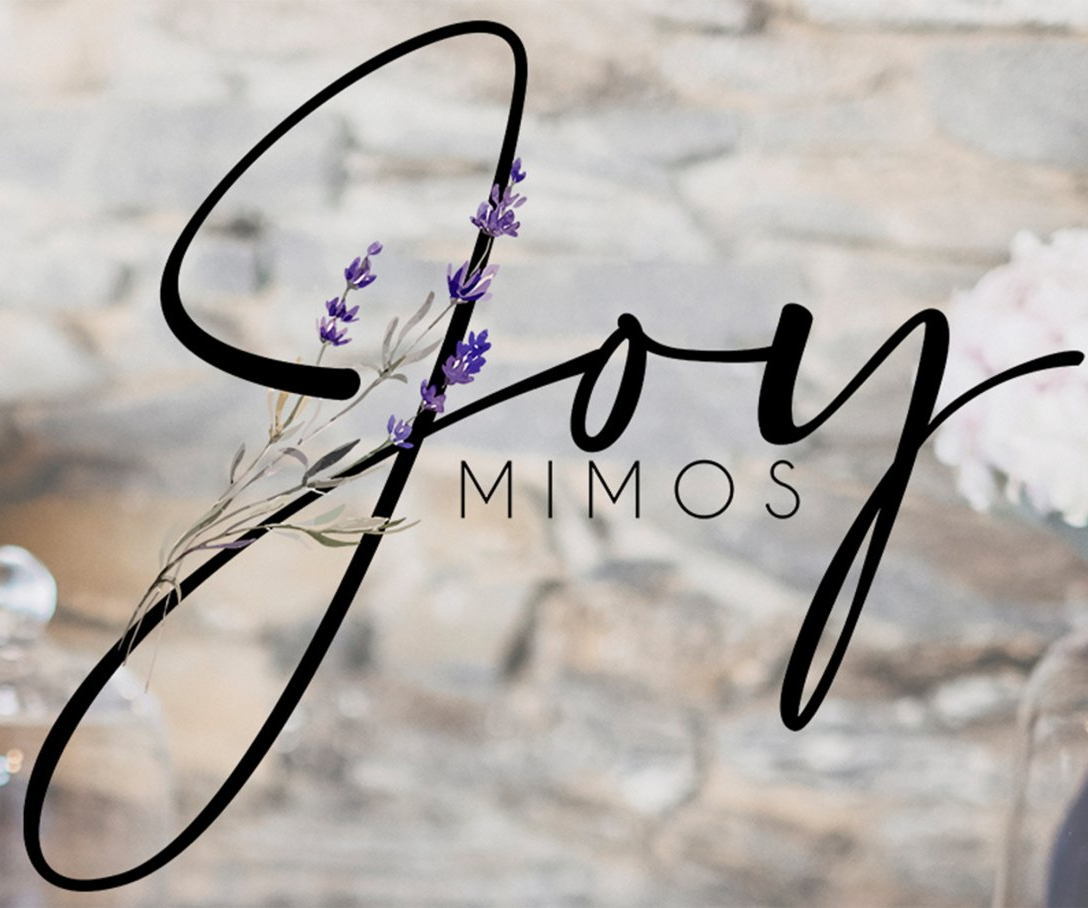
Case: Joy Mimos
The brand's challenge was to innovate a logo and visual identity that had been in place for years, without losing the brand's essence and symbolism.
After precisely realigning the logo, we transformed the brand image into something more modern, chic, and light!
Challenge & Solution
A logo is much more than just an image; it's the brand's communication through elements, colors, and typography.
The main challenge was to change a logo that was familiar to customers without causing initial confusion.
The brand's main colors were retained, but applied in a lighter and cleaner way, resulting in a more elegant look.
Upon completing the transition to the new logo, a brand relaunch event was held, where the new visual identity and updates were presented; in this way, there was no confusion among customers and it brought more meaning and symbolism to the new logo.
Check out the customer testimonial:
"They say my taste is eccentric. I'm not easily impressed, aesthetically speaking... I'm telling you this because the first draft of the visual identity I received from Padme gave me goosebumps. I had never seen this connection and interpretation of identity logo before. The ease of communication and understanding by the client makes me recommend Padme to anyone who asks me. Along with the "package" come extremely dedicated and qualified professionals who know how to express and translate all your ideas into words. I am extremely grateful that my company crossed paths with Padme."
Roberta Fôlego - CEO